Know its getting close to release date but wondered if we could have a second ‘Ticket’ position for automation commands which was aligned to bottom?
Would be nice to have system type commands separated from others and so they can stay in the same position, obviously as things are done the number of visible buttons changes making the buttons jump around.
Could like to have say Close, Logout buttons aligned to bottom on the left ‘ticket’/‘order’ position.
Does that make sense?
Maybe the same could be done in the order position?
I think it would be handy for separating ‘system’ type commands from ticket/order types.
Show a mockup of what you mean. I don’t understand…
We already have:
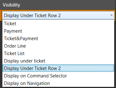
You can also Sort Automation Commands so that they appear in whatever order you like whether top-to-bottom or left-to-right.
And with v5, you can place command buttons in the numpad area as well. You do this via the Menu Categories.
Im thinking Ticket Top and Ticket Bottom;
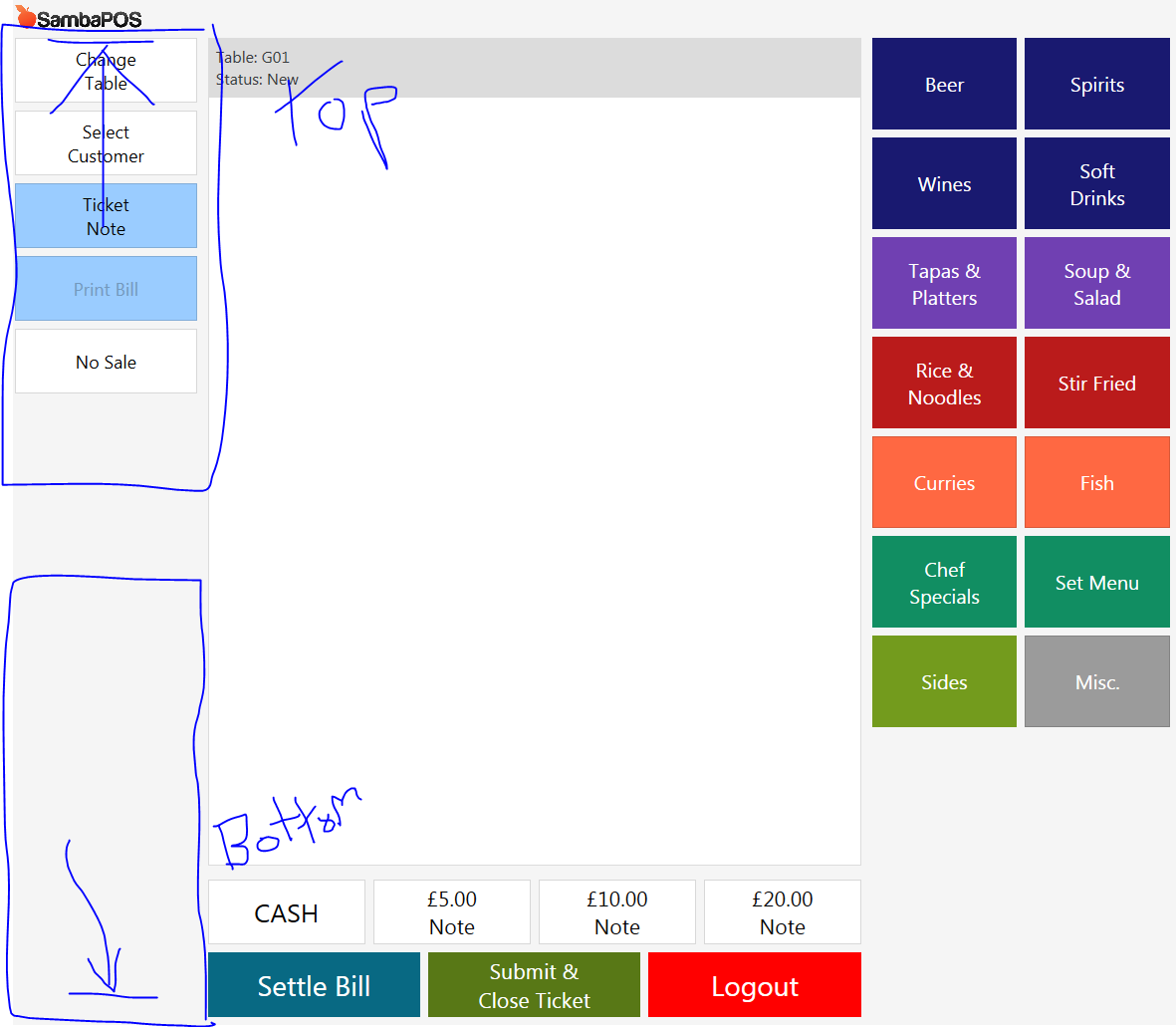
You could then choose a set of buttons to follow the entity screens on thicket +/- on order
And have Bottoms mapped separately aligned to the bottom of that ‘zone’.
Example could be you want to make most of ticket area and have full height and no buttons in the usual settle/close spot and have them to the left.
It would be good to have them aligned to bottom separately to bottom so they dont move with state changes when state based buttons come and go.
Does than make sense?
That I can understand. When the Visible State changes, buttons disappear or appear, causing other buttons to move.
I suppose it might be nice to have
Ticket Upper
Ticket Lower
Order Line Upper
Order Line Lower
1 Like
Thats what I was getting at.
Not sure what @ermre might be able to workout should you put too many as would overlap I guess, maybe some form of flexible frame that goes as far as it can before scroll comes up, at least then there wouldnt be overlap issue but obviously you would want to refine the qty of buttons to avoid this in the first place.
@emre any thoughts on this?
There are lots of related requests. None of them urgent but useful to change ticket screen layout. Maybe on next major version.
1 Like
It would be nice if we have previous/next page of automation command as well (or just scroll-able). Especially, if we divide top and bottom. It probably only 4-6 buttons can fit in one section.
You can turn NUMBERPAD on right into command buttons.
1 Like
Actually, I use change screen menu to switch to system command menu and rarely use commands right now.
1 Like
Arrr, of-course, forgot that one, might take advantage of that ![]()
The thing with split was more about consistent layout for me, ie where some buttons are state bound they come and go causing buttons positions to shift. although obviously would change these to always be visible and just use enabled state.