How the screen will look i wanna see that sir
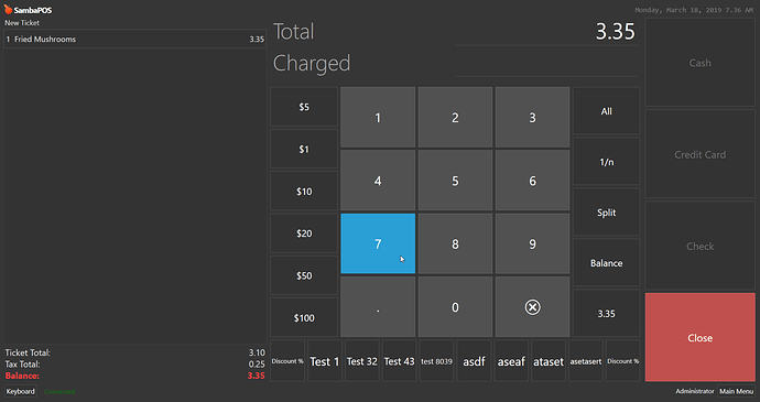
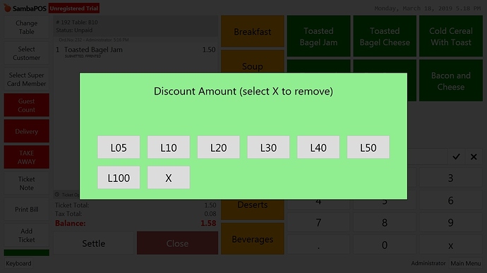
This is what it looks like after only a few discount buttons… and this is on a 30" Screen. Can you imagine on a small 14 or 15 inch monitor.
That many buttons will make them get quite small, perhaps ask question prompt might be a cleaner method given the number of discounts.
Personally I wouldn’t have such big discounts so easily applied without validation. I would use discount cards and entities to auto apply discounts that way staff can’t use the wrong one either accidentally or on purpose
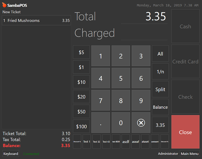
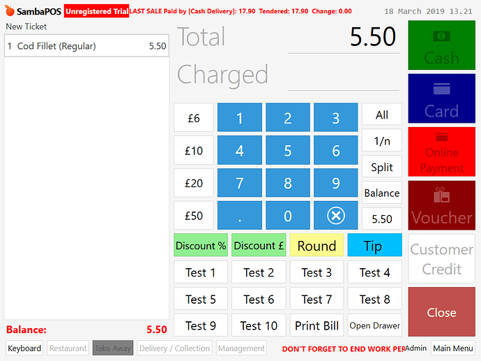
Here is kind of what it may look like on a typical 15 inch screen. This is only 10 discount buttons.
is there any possibility that we move buttons next to numbers button as we see $5 $1 $10 so i thought if we can move this discount buttons.
No there is not. They will only go down below.
There are many other methods that are better for applying discounts. Some of his buttons should probably go on payment screen but some of those discounts can be automated differently and he would prefer them if he saw how they worked.
The Discount 10, Discount 15, Discount 20 etc can probably go as buttons on payment screen. DIscounts like birthday can be automated with things like swipe cards, ask question popups, Can be automatic based on Entity Data.
Does he enter Customers?
yes sir this is for customers example like he has samba company for samba company employees he will make one special discount button and like credit card visa card customers they will have separate discount button because daily they offers for customers
did u got any idea sir for moving buttons
You can make multiple rows of buttons…
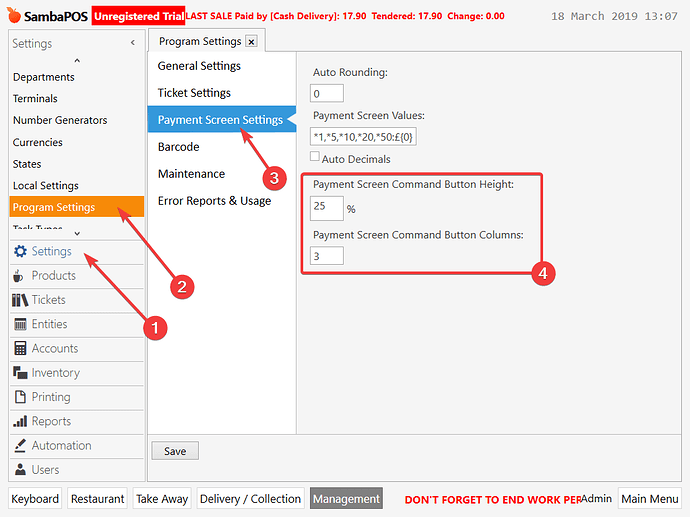
You just need to change the settings in Settings > Program Settings > Payment Screen Settings
So depending on the number of buttons you have, you can set the number of columns of buttons, i.e. if you have 8 buttons, set column to 4 and you will get 2 rows.
Note the more rows of buttons you have, you need to alter the Payment Screen Command Button Height to give more space on the screen to the buttons. However when you do this, the payment screen buttons above will be smaller, so you need to take that into account.
alrgt sir i will check this but i gave one customization he said its ugly hahahahhaa. as i gave him this.
This would also be how I suggest to do it ![]() It’s the same way we handle item discounts from one button:
It’s the same way we handle item discounts from one button:
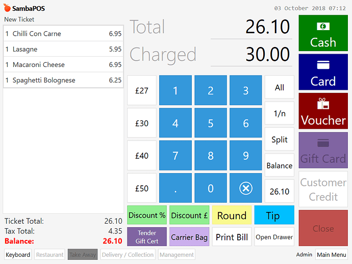
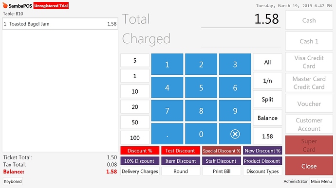
Here is payment screen with 16 buttons, same number as the photo you posted. It doesn’t look all that bad TBH, You just need to remember to adjust the height %. This setup is using 4 columns and height of 45%, this is also same size as a standard 15" 1024x768 screen.
There you go… follow what Mark said above. Make him happy  Next he will want you to make it look like the excel spreadsheet pos he is using now hahahahaah. Sorry bad joke.
PS I just learned something… i never messed with discounts so I never knew you can resize and set columns on those buttons. In the 5 years ive been obsessed with SambaPOS and I never knew you could do that.
sure i will check this and will be back
Don’t worry you didn’t really miss it. It was released sometime around January 2017, even I can’t find where now but I remember I started using it around then it was released.
Only reference I could find was this
LOL I hadnt notice that option either
Hi sir i made types of discount buttons on payment screen but i want make one button name as discount and in that all type of discounts
Hi sir can you help me please
