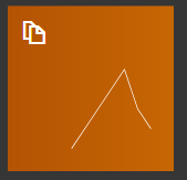
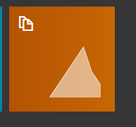
We can do Sparklines and other graphics that simulate bars. We can do arrows etc along with that. It works great for some quick glances at stuff on tiles. I think it might be possible to make Label widgets with it too although I have not tested that.
Ill create a sample right fast. The one listed in the features was a KPI metric we can use that type of script for other purposes as well it was meant as a starter to demonstrate capability.
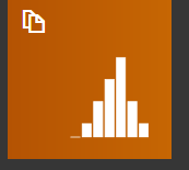
I made it simple so I could take some fast screenshots but that was my Sales per Hour Metric.
For simple testing you can try <sparkline bar 100>1,2,3,4,6,8,2</sparkline> the numbers between the tags represent data. So for example if it was sales per hour you would need to have a SQL query that returns sales per hour comma separated.
the 100 after bar is width of the graphic so I chose 100 for it to fill 100% of available tile space.
As for Pie charts I dont think those are implemented yet or at least were not documented. I know this is not exactly what you were asking for but its a little known feature that was not used by many except maybe me lol. I think its pretty cool.
Of course many people with v5 may just now be discovering this. We discussed it in private and its part of the Features but at that time there were only 3 of us testing or using this so the feature probably got berried in that long features thread and never got much further discussion. I would love to see more improvenement and ideas with this. I think having tiles that can display these quick graphics etc are awesome.
An improvement I would like is the ability to add reference data to the chart like a Key and of course Pie graphic capability.
OK, that would work for me… for now… jajajajajjajaja
where is that KPI script, I will lookup for it…
I would be interested in sales comparissons since we are just starting up, and we are investing a lot of time in facebook promotions. at the moment the only customers we have are from our facebook fan page wich became a nice form of advertising. in one week we got 1.800 friends, 330 likes on the page and a lot of nice comments.