The <sparkline> tag is something we can use to draw simple graphs on Tiles. It’s syntax is as such:
<sparkline [type] [width]>{comma,separated,values}</sparkline>
… where …
[type] is one of:
bar,line, orarea
[width] specifies the width of the graph
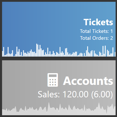
You can create a graph on a Tile that looks like this:
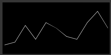
Using sometihng as simple as the following code for the Tile Template:
<block><panel #FF000000><sparkline line 300>1,2,8,3,9,7,4,3,9,13,7</sparkline></panel></block>
Of course that list of numbers is not very useful, so instead we need to gather some interesting data, and present it to the sparkline in a comma-separated format.
This tutorial will show how to create a sparkline graph on 2 different tiles using data from Ticket Sales.
Both of the graphs are using summary data from the 1st of the month, up to today.
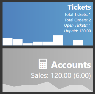
- Tickets Graph shows the Ticket Counts for each day.
- Accounts Graph shows the Average Sale amount per Ticket for each day.
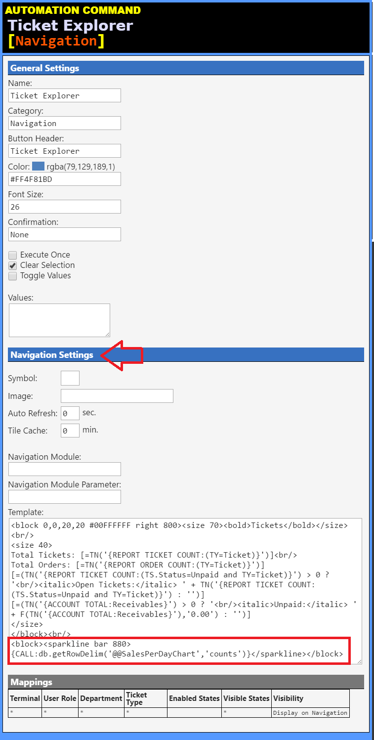
Tickets Tile Template
<block 0,0,20,20 #00FFFFFF right 800><size 70><bold>Tickets</bold></size><br/>
<size 40>
Total Tickets: [=TN('{REPORT TICKET COUNT}')]<br/>
Total Orders: [=TN('{REPORT ORDER COUNT: }')]
[=(TN('{REPORT TICKET COUNT:(TS.Status=Unpaid)}') > 0 ? '<br/><italic>Open Tickets:</italic> ' + TN('{REPORT TICKET COUNT:(TS.Status=Unpaid)}') : '')]
[=(TN('{ACCOUNT TOTAL:Receivables}') > 0 ? '<br/><italic>Unpaid:</italic> ' + F(TN('{ACCOUNT TOTAL:Receivables}'),'0.00') : '')]
</size>
</block><br/>
<block><sparkline bar 880>{CALL:db.getRowDelim('@@SalesPerDayChart','counts')}</sparkline></block>
Accounts Tile Template
<block 0,0,20,20 #00FFFFFF right 800><size 90><sym></sym> <bold>Accounts</bold></size><br/>
<size 70>
Sales: [=F(-1*(TN('{ACCOUNT TOTAL:Sales}')+TN('{ACCOUNT TOTAL:Sales Tax T1}')+TN('{ACCOUNT TOTAL:Sales Tax T2}')),'0.00')] ([=F(-1*(TN('{ACCOUNT TOTAL:Sales}')+TN('{ACCOUNT TOTAL:Sales Tax T1}')+TN('{ACCOUNT TOTAL:Sales Tax T2}'))/20,'0.00')])
</size>
</block><br/>
<block><sparkline area 880>{CALL:db.getRowDelim('@@SalesPerDayChart','averages')}</sparkline></block>
The specific portion of each Template that creates the graphs is this:
<sparkline bar 880>{CALL:db.getRowDelim('@@SalesPerDayChart','counts')}</sparkline>
<sparkline area 880>{CALL:db.getRowDelim('@@SalesPerDayChart','averages')}</sparkline>
So each of the Tiles uses a {CALL:X} tag to call the same JScript handler (db) and function (getRowDelim()), and the same SQL script (@@SalesPerDayChart). The only difference between the 2 Tiles is the type of graph (bar or area), and the last parameter where we specify which aggregate data we want to retrieve from the SQL.
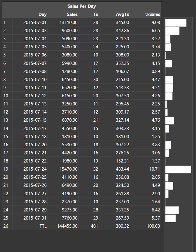
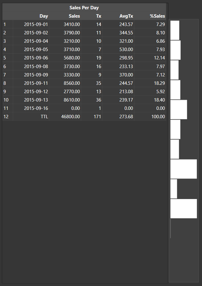
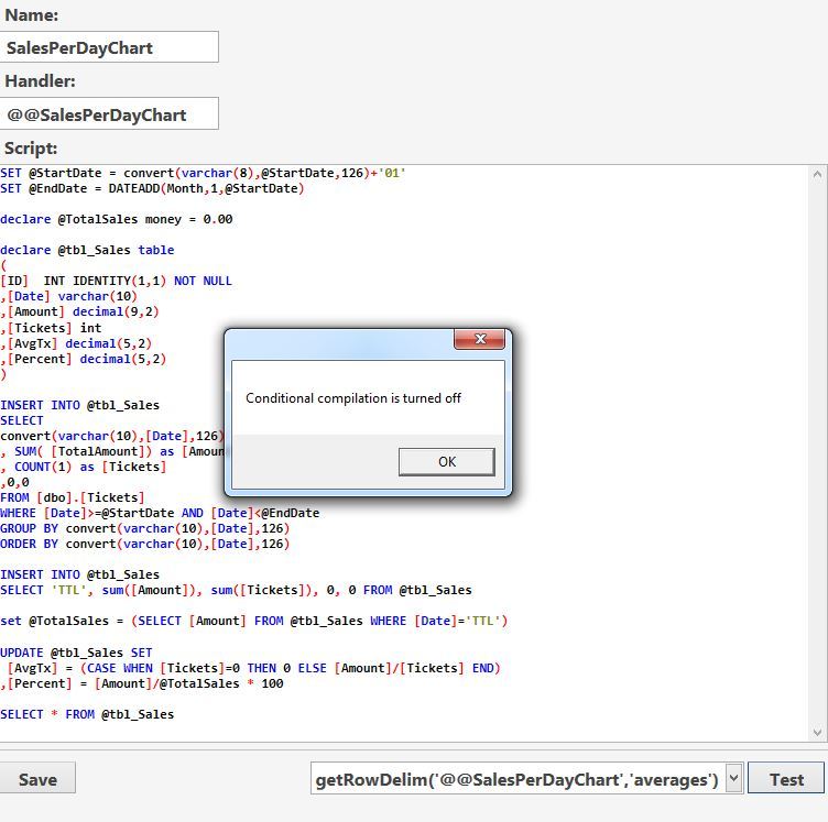
@@SalesPerDayChart
declare @StartDate datetime = convert(varchar(25),GETDATE(),126)
declare @EndDate datetime = convert(varchar(25),GETDATE(),126)

/************************************/

SET @StartDate = convert(varchar(8),@StartDate,126)+'01'
SET @EndDate = DATEADD(Month,1,@StartDate)

declare @TotalSales money = 0.00

declare @tbl_Sales table
(
[ID]  INT IDENTITY(1,1) NOT NULL
,[Date] varchar(10)
,[Amount] decimal(9,2)
,[Tickets] int
,[AvgTx] decimal(5,2)
,[Percent] decimal(5,2)
)

INSERT INTO @tbl_Sales
SELECT
convert(varchar(10),[Date],126)
, SUM( [TotalAmount]) as [Amount]
, COUNT(1) as [Tickets]
,0,0
FROM [dbo].[Tickets]
WHERE [Date]>=@StartDate AND [Date]<@EndDate
GROUP BY convert(varchar(10),[Date],126)
ORDER BY convert(varchar(10),[Date],126)

INSERT INTO @tbl_Sales
SELECT 'TTL', sum([Amount]), sum([Tickets]), 0, 0 FROM @tbl_Sales

set @TotalSales = (SELECT [Amount] FROM @tbl_Sales WHERE [Date]='TTL')

UPDATE @tbl_Sales SET
 [AvgTx] = (CASE WHEN [Tickets]=0 THEN 0 ELSE [Amount]/[Tickets] END)
,[Percent] = [Amount]/@TotalSales * 100

SELECT * FROM @tbl_Sales
The SQL script produces aggregate data in the following format:
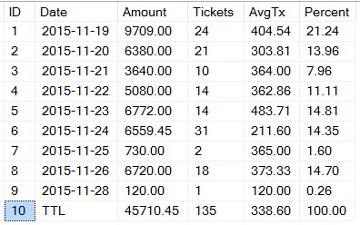
The last 4 columns are the interesting bits.
- Amount (‘
amounts’) - the Transaction Amount for the Tickets for the Day - Tickets (‘
counts’) - the Count of Tickets for the Day - AvgTx (‘
averages’) - the Average Transaction Amount per Ticket for the Day - Percent (‘
percents’) - the Percent of Sales Amount for the Day divided by the Total Sales Amount for the entire Period
We can use JScript to execute the SQL query, and then parse the output to pull out whichever column we want and pivot the data so that it becomes a comma-separated list of values.
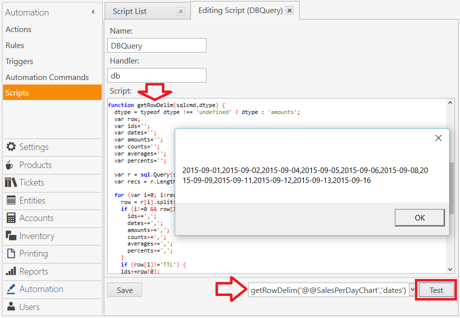
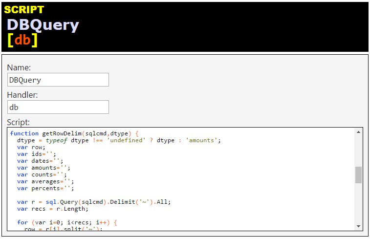
db.getRowDelim(sqlcmd,dtype)
function getRowDelim(sqlcmd,dtype) {
  dtype = typeof dtype !== 'undefined' ? dtype : 'amounts';
  var row;
  var ids='';
  var dates='';
  var amounts='';
  var counts='';
  var averages='';
  var percents='';

  var r = sql.Query(sqlcmd).Delimit('~').All;
  var recs = r.Length;

  for (var i=0; i<recs; i++) {
    row = r[i].split('~');
    if (i!=0 && row[1]!='TTL') {
      ids+=',';
      dates+=',';
      amounts+=',';
      counts+=',';
      averages+=',';
      percents+=',';
    }
    if (row[1]!='TTL') {
    ids+=row[0];
    dates+=row[1];
    amounts+=row[2];
    counts+=row[3];
    averages+=row[4];
    percents+=row[5];
    }
  }
  switch (dtype) {
    case 'ids':
      return ids;
    case 'dates':
      return dates;
    case 'amounts':
      return amounts;
    case 'counts':
      return counts;
    case 'averages':
      return averages;
    case 'percents':
      return percents;
    default:
      return amounts;
  }
}
Using the SQL, and the dtype parameter to select the data we want, we choose from the following types, and return pivoted, comma-separated values for each day of the month:
'ids'
'dates'
'amounts'
'counts'
'averages'
'percents'
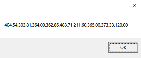
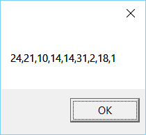
So if we call the script with:
getRowDelim('@@SalesPerDayChart','counts')
… then the returned data looks like this:
Alternatively, if we call the script with:
getRowDelim('@@SalesPerDayChart','averages')
… then the returned data looks like this: