So I have a few designers competing to design my new logo for my food truck. Here is a poll of my top designs out of these which do you think is the best? Please help me out and take the pole, rate each one and then vote for which one you like the best.
Personally I think disforia graphics have the more refined Finnish.
One thing to remember though is to think about all uses. Most of those designs are pretty complex and would probably not come out clear with embroidery for uniforms etc. Not that its end of the world but just a entity fr my experience in the design and printing world. I would reconmend having the designer offer a second simplified and reduced colour count version for certain issues.
The hotel crest of arms is quite complex in this way so I had my guy work a single colour siluette/ouline type version which we use for backgrounds and depth rather than full colour version.
1 Like
The primary goal is for the side of my truck. But yes your right. He did a flat version too. Disforia is my current fav. He actually drew most of his it’s not cut and paste.
@Jesse I have placed my vote.
They are all pretty cool logos. I like the fire on #25 unless ice cream is your main line.
I would like to see #53 with the fire instead of the ice cream, that might look better.
All the best
1 Like
You can tell, it’s much more refined than most of the others and bilt up from base rather than put together.
2 Likes

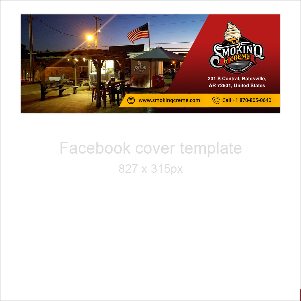
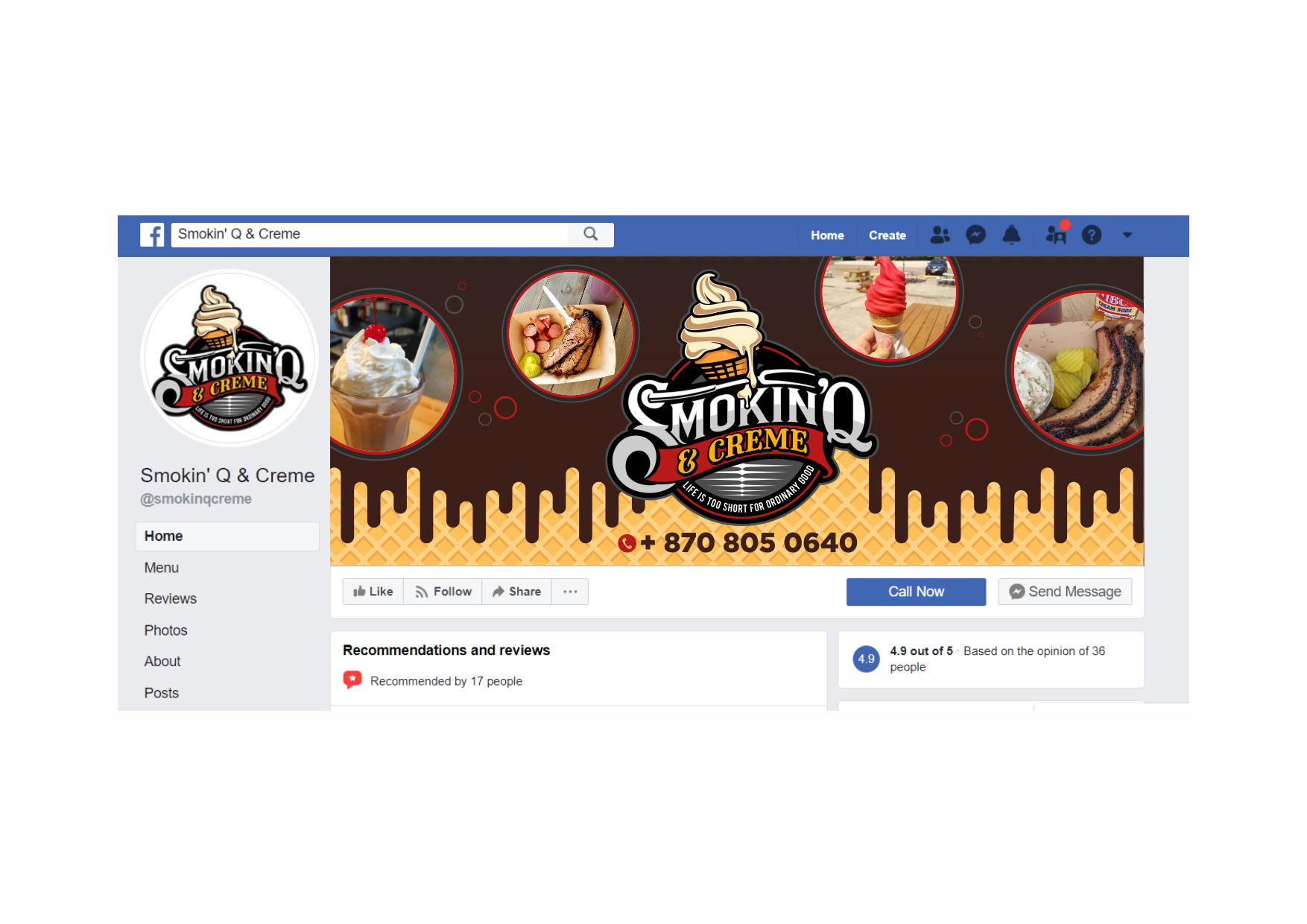
Now I have them designing me a new facebook cover as well. So far I have not had one come in that hits me but there is still 2 days left in the contest.
This one kinda catches my eye but I feel they can do better
1 Like
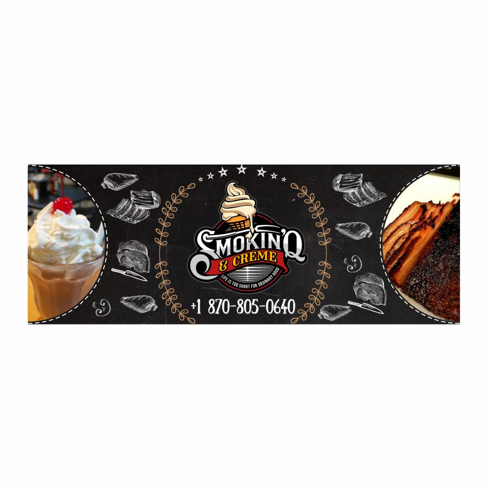
I like that third one the best (combination of the first two kinda) so you get a bit of what the wife wants too lol 
1 Like
I like the third one too, logo pops on the darker background.
Personally though I would say it’s overly symetrical.
Also you need to tweek positioning of plain logo :-p bit cut out from circle cut.
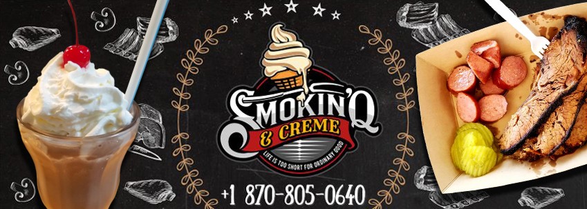
I’d have filled that tray a little more :-p
Dang stuff is expensive lol. I use USDA Prime Certified Black Angus brisket thats aged 21 days.
1 Like
For Facebook banner you can take a close up photo of the truck with staff smiling inside. Maybe some of your products on the display too. And copy the banner. Should look very welcoming
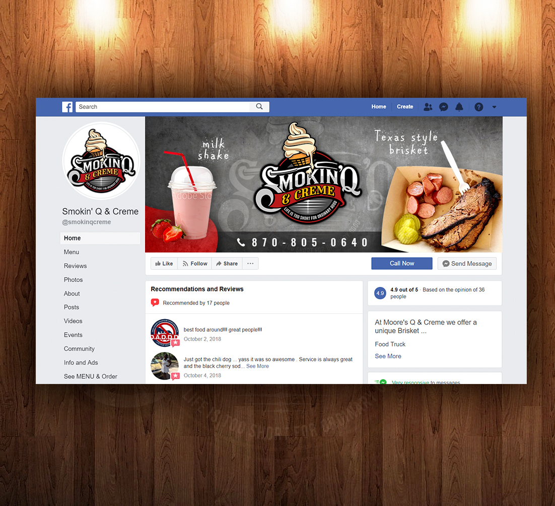
These 2 designers did an awesome job. I may hire them to do more work in the future. The logo cost me $299 kinda pricey but not really and totally worth it for the work done and it was less than 7 days. The facebook cover cost me $79 3 days. Money well spent I think.
3 Likes
Love the design. Suits your business very well
Got it for a reasonable price too.
1 Like