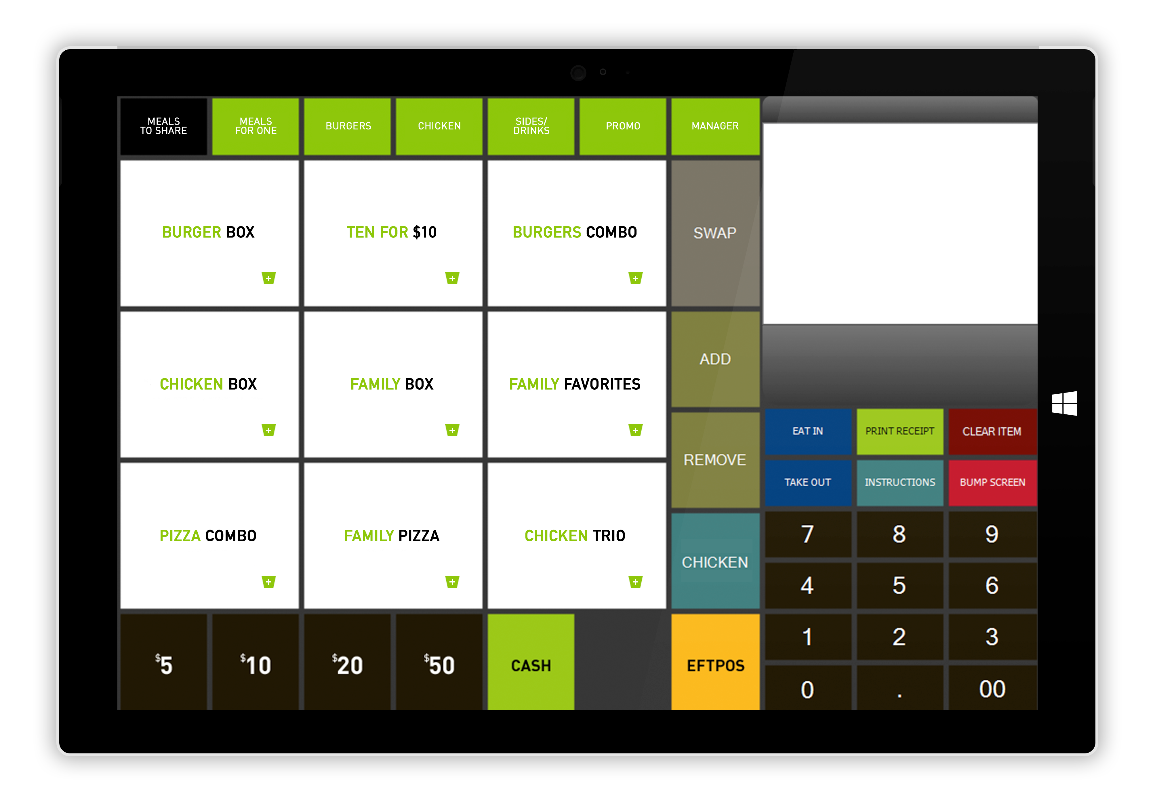
I know Ive already requested many similar features, but i’ve always felt Im missing in the screen I want to acheive. Ive found this from a very high end comapny and it would be perfect like this!
This is not possible at the moment, i know people have requested to be able to design their own pos screen, something I would also like to do, but it certainly wont happen in V5 as it is a while design change
Emre may have noted it for V6 but we dont have any details about V6 hes still in the early stages of planning it. Thats said, he keeps an eye on the forum to see if there a things he could put into V6 but dont expect anything soon 
Yes, I already know all this hahahah! I was mainly showing @emre my idea of a perfect screen… Tecnically you could make something like this with HTML in an custom entiyt screen for a web page and just use the pressing command buttons
1 Like
Actually you can have most of those functions on the POS screen already, just not in the same layout. Is it important for the layout to be identical to the screenshot? If so, why?
No its not important, I would just like to have a smaller order screen with the keypad underneath, I think thats logiacl. And have different sized buttons
I see. I think you can do everything except have smaller order screen and put the keypad underneath right now.
All the buttons you can resize and you can add Automation Command buttons to menus if you want like Rick has done.
Yes… But as you can see the buttons on this screen are all different sizes.
Menu buttons you can change the size of. Other Automation Command buttons you can change the font size, I am not sure if changing the font size would automatically resize the button, but also it’s done that way so the screen is responsive - open it on different screen sizes and it scales to fit. Open it on a tablet and rotate to portrait orientation and the screen resizes and fits.
Wouldn’t need HTML you could design that completely with label widgets and automation buttons even a mock ticket screen view. Of course you would need to automate your own ticket functions it would be way too complex to really be useful.
Emre had a reason for putting ticket on left. It was discussed in this forum I just can’t find it.
V6 will certainly be more flexible. I think you guys will flip out when you see his plans.
1 Like
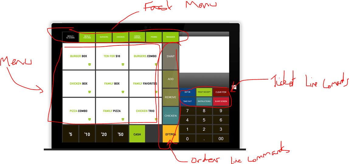
If you break it down and egnolage the order screen is probably a bit bigger than it needs to be its almost a mirror image of samba;
If you ditch the keyboard altogether like I have and opt for [?Prompt] for things like price change etc…
Samba layout using same graphic sliced and rearranged similar to samba.
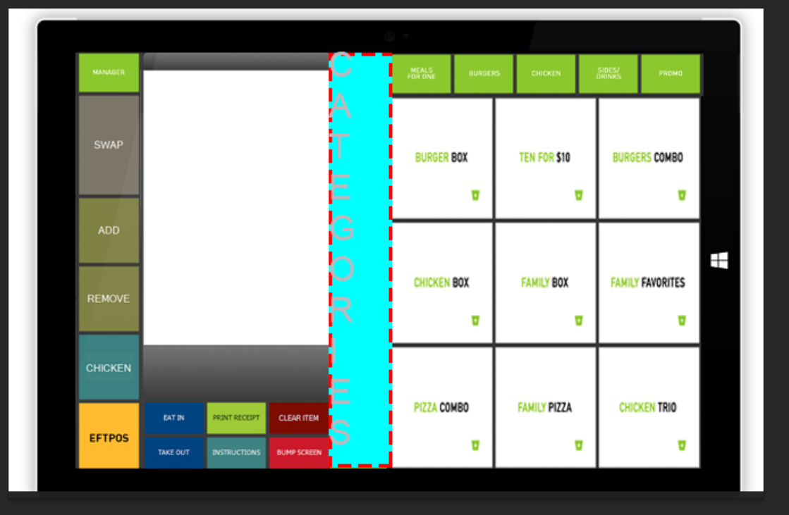
I would generally say it would be better on the left most of the time.
its estimated that 70-90% of the work are right handed, so would it not be more comfortable to have buttons on the right and order list on the left… ![]()
Thats not to say I dont have some ideas myself on impoved layout but would be good it we could tweek our own ![]()
One interesting observation I have noticed, and not sure how conclusive this is, but it would appear any POS software that is designed for use on a tablet / iPad tends to have the ticket on the right. Not sure why that is. Maybe there is some genius UI/UX reason, or maybe one person did it first and the rest copied it. ![]()
That seems very odd to me, am right handed and would always hold in left hand and tap with right!!!
I think one did it and everyone else followed suite LOL
1 Like