When you click back button icon it will switch back to ticket without a change.
Clicking cross icon will remove entity. For example if you want to remove table or customer from a ticket you can use this button. This feature can be disabled for users with “Can remove ticket entity” permission.
I simply can’t read most of the text on the v4 version, even with BOLD enabled. Plus, the extra margin you’ve introduced causes items to be off the bottom of the screen, forcing me to scroll. And I never did like Segoi UI font, nor the “Metro” interface (it’s like going back to Win3.1).
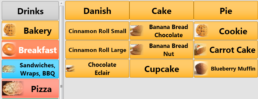
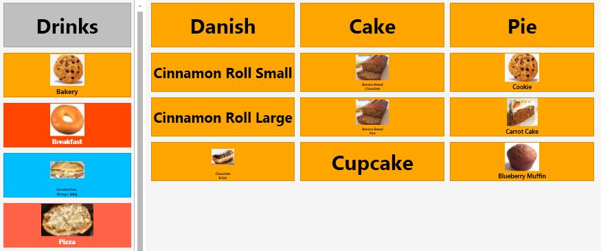
Most V3 feedbacks about button images was using bigger images. So instead of using iconic images we decided to change layout. If you increase button heights a little bit and use bigger images you’ll have a result like this. Also single line captions will look better.
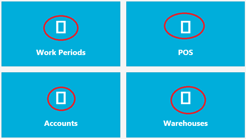
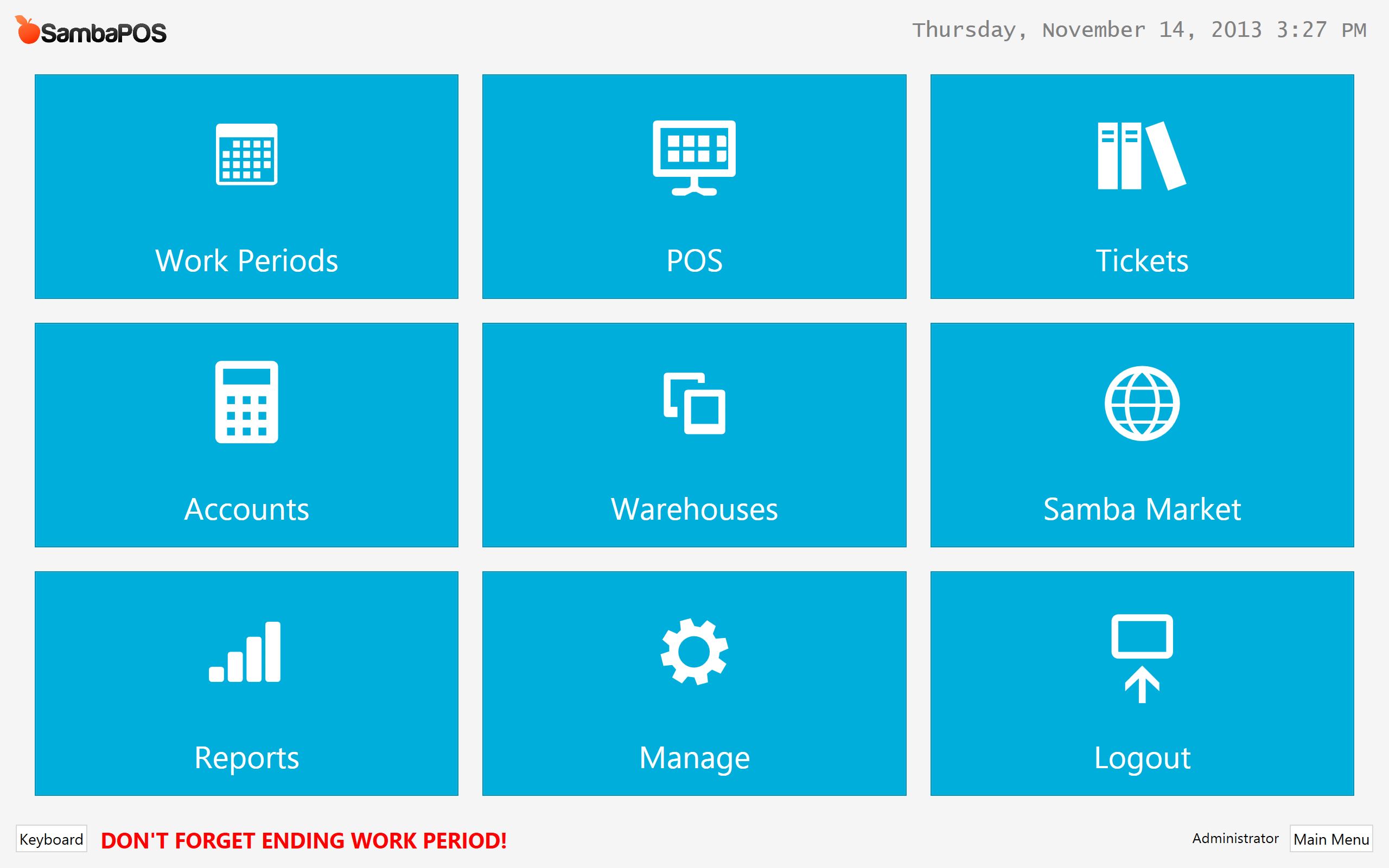
We’re using segoe ui font for text since V2. For v4 we’re using segoe ui symbol font for icons. While installing V4 it should ask you to install symbol font so if you permit it your navigation screen should appear as this.
Using a symbol font makes development easier and while scaling items for screen it should work faster.
Maybe our Metro UI implementation is not good yet. Using less graphical features (borders, gradiends, roundings) is a great idea in general.
Just let us know what does not work fine for you so we can improve it. For example after examining your screenshots I can see we should support left aligned images for category buttons.
I really appreciate your work Emre. I agree, using less graphical features is a great idea in general, since it should speed up rendering and such.
I do remember the installation prompting me regarding Segoe, indicating that it was already installed, asking if I wanted to replace it - I clicked “No” since it indicated it was already installed. I later realized that the font was the same in both versions, and that I must have missed the Seqoe Symbol installation somehow.
I like the idea of what your screenshots are trying to accomplish; however, it doesn’t work well with my setup, and may not for others either. Perhaps there could be an option to choose whether to left-align images (the old way), or center them (the new way) for menu items and categories.
Something else I’ve always wanted to see is some sort of indication of which category is currently selected, with a highlight or an outline perhaps around the category, or an indicator bar on the right or left of the category.
P.S. Since we’re talking about UI, could you split this conversation, and move all of this discussion to the Topic of UI that you already have?
@QMcKay I like V3 design too. This is also my creation haha… Honestly when I first saw Metro UI examples my reaction was similar to yours. After reading about it more I understood the idea. This is something about using graphics, colors, symbols, fonts and animations together for better user experience. Some apps implemented it nice but most metro ui implementations are not good. SambaPOS 4 UI also have little issues and I believe as we share our experiences more we can improve it for better usage.
You already have Segoe UI Symbol font but not the version SambaPOS trying to install. There is no other safe way to install this font to windows 7 and OS asks this question. You can safely say yes on next install.
Left aligned images is in my todo list.
Highlighting selected category is also in my list.
No problem to keep posts here since other people might wonder same thing. Feel free to create new topics for further ideas. Thanks.
Yes I’ve decreased dependency to .net framework as 4.1.13 but I don’t know why 4.1.14 stopped working. That might be another issue. Do you see an error message?
OK, version 4.17 works on XP, didnt get the chance to test all needed but will do shortly. One thing is for sure, V4 UI is brighter and makes it much harder and not so “sexy” when working in darker places like my pub