I am going to deploy a tablet in production. Any chance we can get an option to reduce ticket area or have a option for 16x9 aspect ratio. SambaPOS looks really good on 4x3 displays, but 16x9 displays there a large white space after our products.
All my new setups are 16x9 displays. Reducing ticket area will free up more space for Category section.
I think ticket area is very large. Receipt printers can not print that many characters.
I am working with Surface Pro 3 and XPS13. XPS is my testing computer. I plan to deploy Surface Pro 3.
The screen shot is from Surface Pro 3. I believe issue is related to aspect ratio and not screen screen size. There is a significant white space on all 16x9 devices. I have used 10", 13", 20" and 23" 16x9 displays and they all look the same.
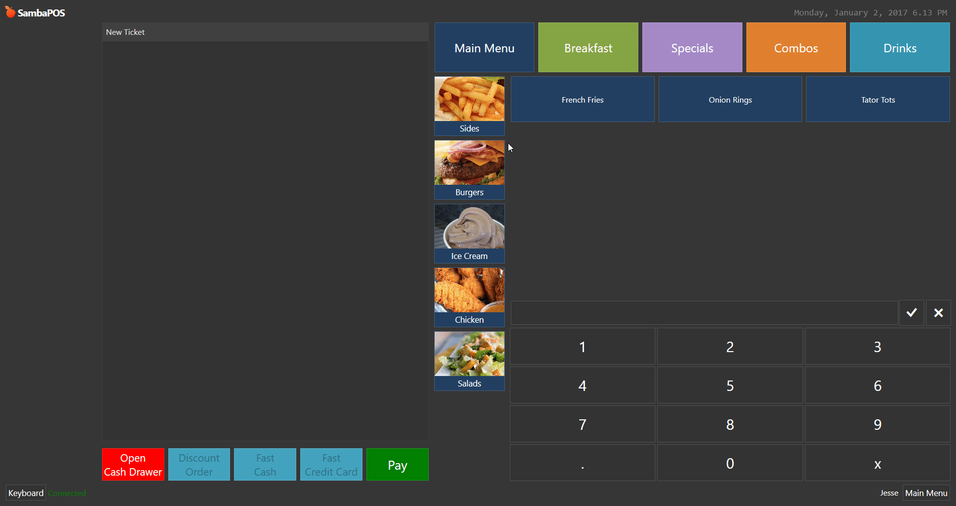
I dunno I kind of like it like it is. But I can see why you might not want it. However I got around the category issue by using menu swapping. Notice I have Menus listed across the top and Categories on left. I also have special formatting for combos as you will see and it uses the space nicely.
Using the menu swap technique really makes categories look a lot better. Each button on top loads more categories. I reduced my categories area down significantly and it looks and flows really good.
My setup has a few more menu Categories then your setup. And I still need to add a few more Categories. As you can see the Categories are getting very small relative to all other POS buttons. I don’t like to add any Categories on top, because it will start messy. Just a personal preference.
Those are not categories on top. It’s menus. I have over 25 categories. But it looks like I don’t. It flows really well. My categories are all on left like yours. All 25 of them.
Absolutely true it is personal preference… I think a huge amount of categories looks ugly and cluttered and confusing. Anyway I dont know if Emre would consider making a change like this right now expecially when tablet focus will come from PMPos soon. But who knows Emre does amazing things.
And i dont have any categories on the left, all my categories are different menus at the top
I also dont have any buttons mapped to ticket and this expands the ticket area to fill that space. I agree that controlling the width of the ticket on screen would be good as especially when you have the ticket expanded as i do there is even more “dead space”
Ideally when no buttons are mapped to ticket we should expand the menu area instead of the ticket area as thats the area where we will have the most buttons being added
The option to reduce ticket space which then increases menu area and vice versa i think would be good
I believe this feature would be very useful for any setup that has a large menu. I have one setup that has 4 columns. Buttons are pretty small with 4 columns.
Again its all in perspective… but Personally if you shrink it then your buttons below it get squished as well. I prefer the single row square buttons… but like you said its personal preference.
I think a lot of ppl try to reduce number of click on the menu. But I think less buttons to look for on the screen even tho you have to click 2 or 3 times more, is faster than look for the right button in 50 buttons on screen.
For example, shouldn’t Omelet, Scramble and Eggs be in the same category?
I disagree. Category buttons are static. They rarely change, servers memorize category locations. Extra clicks will slow down order entry. I am speaking from experience. I was a server for many years before my IT career.
Yes, I knows that true and that is also my point.
If you have some staffs that only work few hours a week or always have new ppl it would be slower for them.
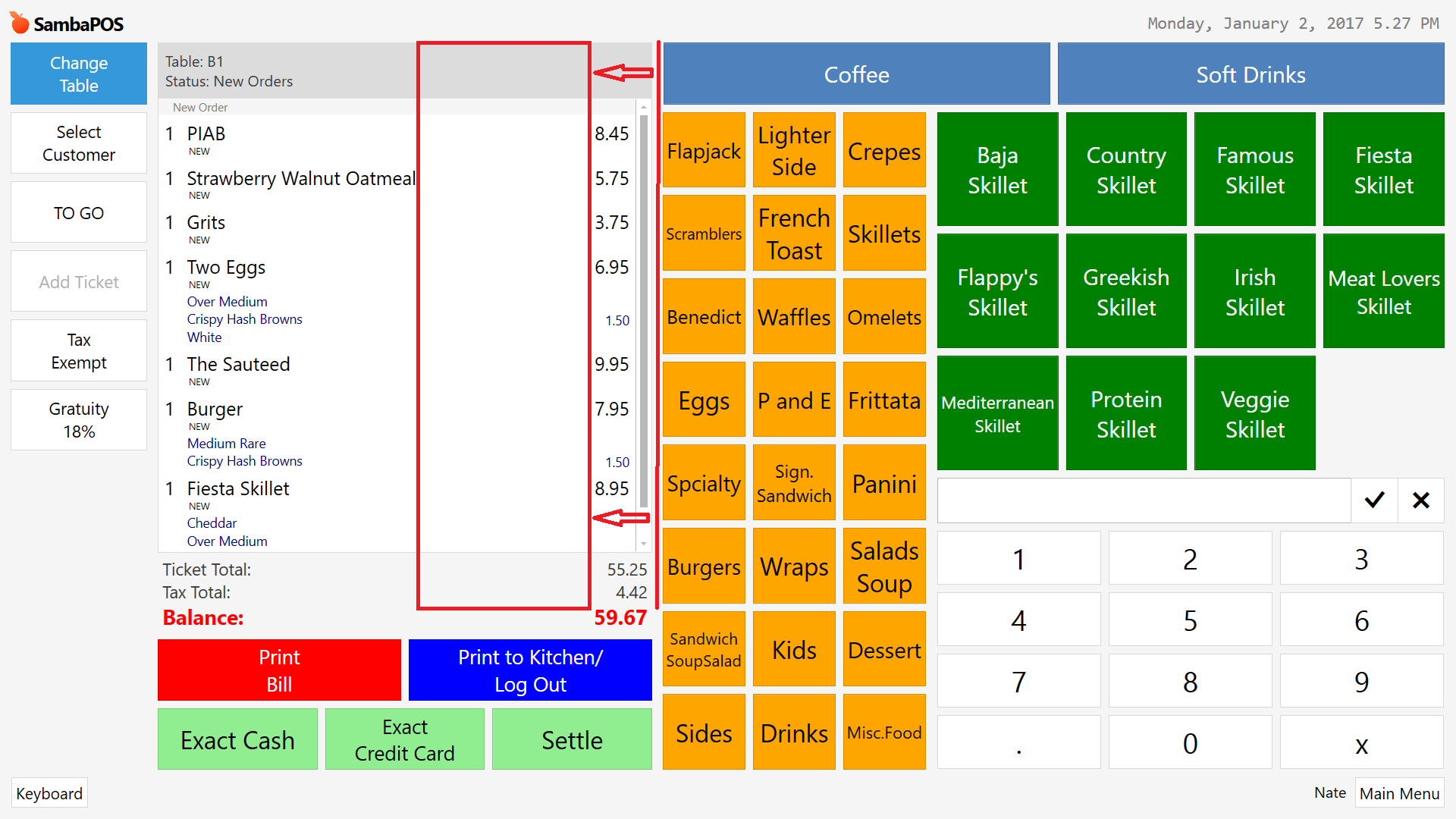

 And I still need to add a few more Categories. As you can see the Categories are getting very small relative to all other POS buttons. I don’t like to add any Categories on top, because it will start messy. Just a personal preference.